SmartBar

component • $79

RW Pro Space

2026-05-12

Version 1 (9)

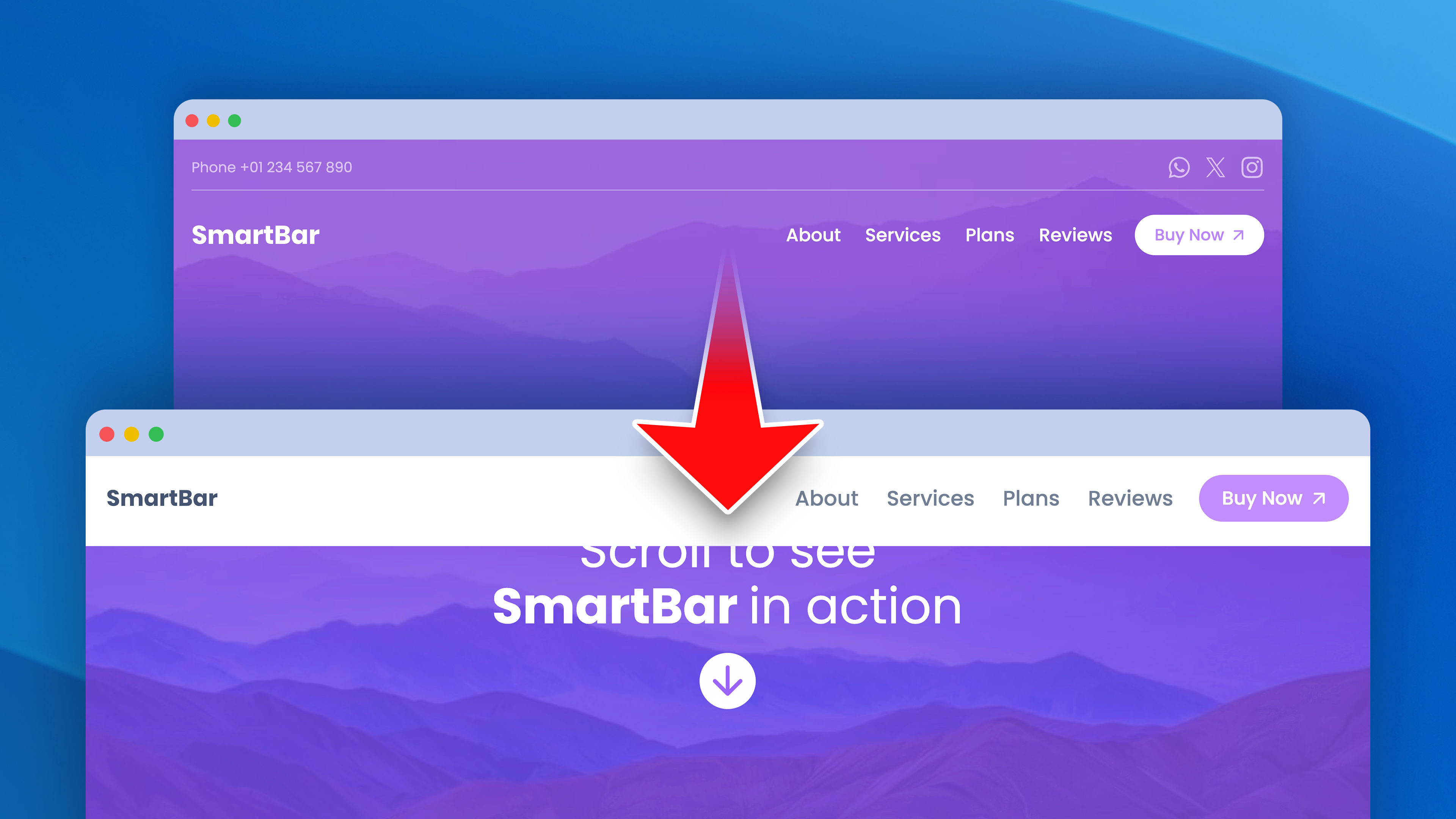
A powerful, fully customizable navigation bar that adapts its look as users scroll — with three independent styling states, section-aware color switching, and pixel-perfect responsive control.

SmartBar ships with three styling states — Default, Stuck, and Custom — each fully configurable with independent colors, borders, radius, shadow, and backdrop blur. Use SmartBar Anchors (the companion component) to change styles per section, control child component colors (Logo, Menu, custom elements). Enable One Page Navigation, set up dismissible announcement bars, and fine-tune every detail across breakpoints. Built for designers who demand pixel-perfect control.

Release Notes

Build 9 2026-04-27
Minor fixes to the demo project file.
Build 8 2026-04-21
Updated demo project thumbnail.
Build 7 2026-04-21
Updated demo project thumbnail.
Build 6 2026-04-21
[FIX] Renamed the thumbnail file in the demo project.
Build 5 2026-04-21
[IMPROVE] Demo project file.
Build 4 2026-04-21
[FIX] Menu One Page Nav: items rendered black after scroll-up
[FIX] Top Offset Default no longer acts as margin-top
[NEW] Announcement dismiss modes (Dropzone / Class)
[NEW] Utility classes sb-show-default / sb-show-stuck / sb-show-custom
[IMPROVE] SmartBar Anchor Editor Preview panel restruct
Build 3 2026-04-21
[UPDATE] Project demo file
Build 2 2026-04-21
- [NEW] Side arrows in SmartBar Anchor for better position visualization in the editor.
- [NEW] Pulsing side arrows in SmartBar Anchor when Debug mode is enabled.
- [UPDATE] Demo project file.
Build 1 2026-04-21
- Initial release